This guide compares three popular Python data visualization libraries: Matplotlib, Seaborn, and Altair (Vega-Altair). Each library has its own strengths, weaknesses, and ideal use cases. This comparison will help you choose the right tool for your specific visualization needs.
Quick Reference Comparison
| Feature | Matplotlib | Seaborn | Altair |
|---|---|---|---|
| Release Year | 2003 | 2013 | 2016 |
| Foundation | Standalone | Built on Matplotlib | Based on Vega-Lite |
| Philosophy | Imperative | Statistical | Declarative |
| Abstraction Level | Low | Medium | High |
| Learning Curve | Steep | Moderate | Gentle |
| Code Verbosity | High | Medium | Low |
| Customization | Extensive | Good | Limited |
| Statistical Integration | Manual | Built-in | Good |
| Interactive Features | Limited | Limited | Excellent |
| Performance with Large Data | Good | Moderate | Limited |
| Community & Resources | Extensive | Good | Growing |
Matplotlib
Matplotlib is the foundational plotting library in Python’s data visualization ecosystem.
Strengths:
- Fine-grained control: Almost every aspect of a visualization can be customized
- Versatility: Can create virtually any type of static plot
- Maturity: Extensive documentation and community support
- Ecosystem integration: Many libraries integrate with or build upon Matplotlib
- Performance: Handles large datasets well
Weaknesses:
- Verbose syntax: Requires many lines of code for complex visualizations
- Steep learning curve: Many functions and parameters to learn
- Default aesthetics: Basic default styling (though this has improved)
- Limited interactivity: Primarily designed for static plots
Example Code:
import matplotlib.pyplot as plt
import numpy as np

# Sample data
x = np.linspace(0, 10, 100)
y = np.sin(x)

# Create figure and axis
fig, ax = plt.subplots(figsize=(8, 4))

# Plot data
ax.plot(x, y, label='Sine Wave')

# Add grid, legend, title and labels
ax.grid(True)
ax.set_xlabel('X-axis')
ax.set_ylabel('Y-axis')
ax.set_title('Simple Sine Wave Plot')
ax.legend()

plt.tight_layout()
plt.show()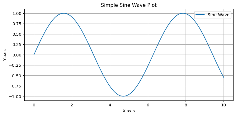
When to use Matplotlib:
- You need complete control over every aspect of your visualization
- You’re creating complex, publication-quality figures
- You’re working with specialized plot types not available in higher-level libraries
- You need to integrate with many other Python libraries
- You’re working with large datasets
Seaborn
Seaborn is a statistical visualization library built on top of Matplotlib.
Strengths:
- Aesthetic defaults: Beautiful out-of-the-box styling
- Statistical integration: Built-in support for statistical visualizations
- Dataset awareness: Works well with pandas DataFrames
- Simplicity: Fewer lines of code than Matplotlib for common plots
- High-level functions: Specialized plots like
lmplot,catplot, etc.
Weaknesses:
- Limited customization: Some advanced customizations require falling back to Matplotlib
- Performance: Can be slower with very large datasets
- Restricted scope: Focused on statistical visualization, not general-purpose plotting
Example Code:
import seaborn as sns
import matplotlib.pyplot as plt
import numpy as np
import pandas as pd

# Create sample data
x = np.linspace(0, 10, 100)
y = np.sin(x) + np.random.normal(0, 0.2, size=len(x))
data = pd.DataFrame({'x': x, 'y': y})

# Set the aesthetic style
sns.set_theme(style="whitegrid")

# Create the plot
plt.figure(figsize=(8, 4))
sns.lineplot(data=data, x='x', y='y', label='Noisy Sine Wave')
sns.regplot(data=data, x='x', y='y', scatter=False, label='Regression Line')

# Add title and labels
plt.title('Seaborn Line Plot with Regression')
plt.xlabel('X-axis')
plt.ylabel('Y-axis')
plt.legend()

plt.tight_layout()
plt.show()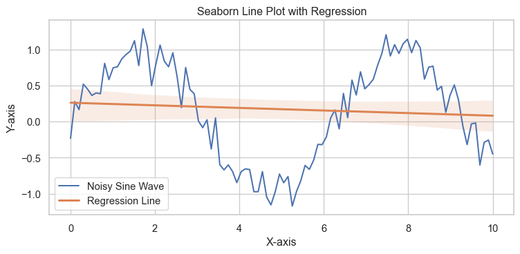
When to use Seaborn:
- You want attractive visualizations with minimal code
- You’re performing statistical analysis
- You’re working with pandas DataFrames
- You’re creating common statistical plots (distributions, relationships, categorical plots)
- You want the power of Matplotlib with a simpler interface
Altair (Vega-Altair)
Altair is a declarative statistical visualization library based on Vega-Lite.
Strengths:
- Declarative approach: Focus on what to visualize, not how to draw it
- Concise syntax: Very readable, clear code
- Layered grammar of graphics: Intuitive composition of plots
- Interactive visualizations: Built-in support for interactive features
- JSON output: Visualizations can be saved as JSON specifications
Weaknesses:
- Performance limitations: Not ideal for very large datasets (>5000 points)
- Limited customization: Less fine-grained control than Matplotlib
- Learning curve: Different paradigm from traditional plotting libraries
- Browser dependency: Uses JavaScript rendering for advanced features
Example Code:
import altair as alt
import pandas as pd
import numpy as np

# Create sample data
x = np.linspace(0, 10, 100)
y = np.sin(x) + np.random.normal(0, 0.2, size=len(x))
data = pd.DataFrame({'x': x, 'y': y})

# Create a simple scatter plot with interactive tooltips
chart = alt.Chart(data).mark_circle().encode(
    x='x',
    y='y',
    tooltip=['x', 'y']
).properties(
    width=600,
    height=300,
    title='Interactive Altair Scatter Plot'
).interactive()

# Add a regression line
regression = alt.Chart(data).transform_regression(
    'x', 'y'
).mark_line(color='red').encode(
    x='x',
    y='y'
)

# Combine the plots
final_chart = chart + regression

# Display the chart
final_chart
When to use Altair:
- You want interactive visualizations
- You prefer a declarative approach to visualization
- You’re working with small to medium-sized datasets
- You want to publish visualizations on the web
- You appreciate a consistent grammar of graphics
Common Visualization Types Comparison
Scatter Plot
Matplotlib:
import matplotlib.pyplot as plt
import numpy as np

x = np.random.randn(100)
y = np.random.randn(100)

plt.figure(figsize=(8, 6))
plt.scatter(x, y, alpha=0.7)
plt.title('Matplotlib Scatter Plot')
plt.xlabel('X-axis')
plt.ylabel('Y-axis')
plt.grid(True)
plt.show()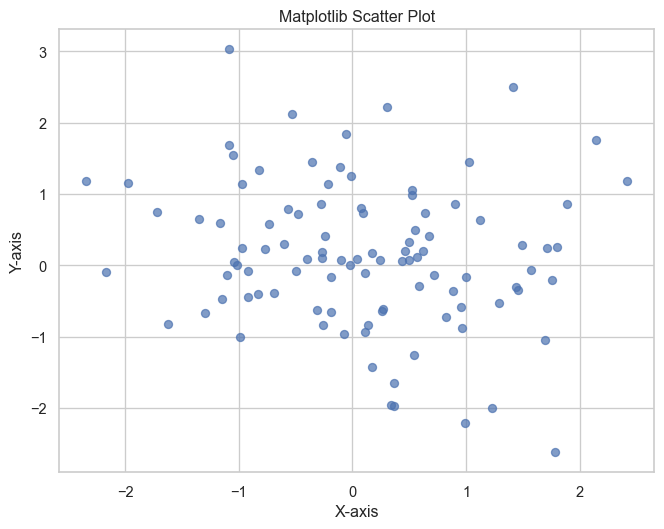
Seaborn:
import seaborn as sns
import matplotlib.pyplot as plt
import numpy as np
import pandas as pd

data = pd.DataFrame({
    'x': np.random.randn(100),
    'y': np.random.randn(100)
})

sns.set_theme(style="whitegrid")
plt.figure(figsize=(8, 6))
sns.scatterplot(data=data, x='x', y='y', alpha=0.7)
plt.title('Seaborn Scatter Plot')
plt.show()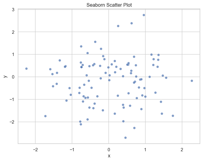
Altair:
import altair as alt
import pandas as pd
import numpy as np

data = pd.DataFrame({
    'x': np.random.randn(100),
    'y': np.random.randn(100)
})

alt.Chart(data).mark_circle(opacity=0.7).encode(
    x='x',
    y='y'
).properties(
    width=500,
    height=400,
    title='Altair Scatter Plot'
)
Histogram
Matplotlib:
import matplotlib.pyplot as plt
import numpy as np

data = np.random.randn(1000)

plt.figure(figsize=(8, 6))
plt.hist(data, bins=30, alpha=0.7, edgecolor='black')
plt.title('Matplotlib Histogram')
plt.xlabel('Value')
plt.ylabel('Frequency')
plt.grid(True, alpha=0.3)
plt.show()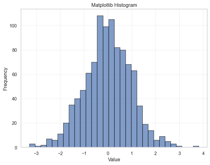
Seaborn:
import seaborn as sns
import matplotlib.pyplot as plt
import numpy as np

data = np.random.randn(1000)

sns.set_theme(style="whitegrid")
plt.figure(figsize=(8, 6))
sns.histplot(data=data, bins=30, kde=True)
plt.title('Seaborn Histogram with KDE')
plt.show()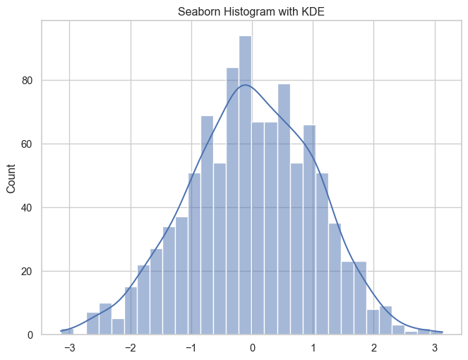
Altair:
import altair as alt
import pandas as pd
import numpy as np

data = pd.DataFrame({'value': np.random.randn(1000)})

alt.Chart(data).mark_bar().encode(
    alt.X('value', bin=alt.Bin(maxbins=30)),
    y='count()'
).properties(
    width=500,
    height=400,
    title='Altair Histogram'
)
Line Plot
Matplotlib:
import matplotlib.pyplot as plt
import numpy as np

x = np.linspace(0, 10, 100)
y1 = np.sin(x)
y2 = np.cos(x)

plt.figure(figsize=(10, 6))
plt.plot(x, y1, label='Sine')
plt.plot(x, y2, label='Cosine')
plt.title('Matplotlib Line Plot')
plt.xlabel('X-axis')
plt.ylabel('Y-axis')
plt.legend()
plt.grid(True)
plt.show()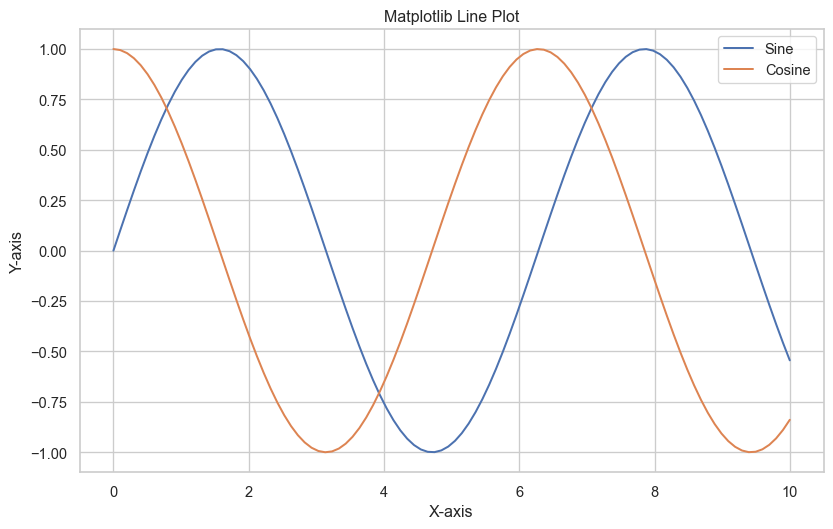
Seaborn:
import seaborn as sns
import matplotlib.pyplot as plt
import numpy as np
import pandas as pd

x = np.linspace(0, 10, 100)
data = pd.DataFrame({
    'x': np.concatenate([x, x]),
    'y': np.concatenate([np.sin(x), np.cos(x)]),
    'function': ['Sine']*100 + ['Cosine']*100
})

sns.set_theme(style="darkgrid")
plt.figure(figsize=(10, 6))
sns.lineplot(data=data, x='x', y='y', hue='function')
plt.title('Seaborn Line Plot')
plt.show()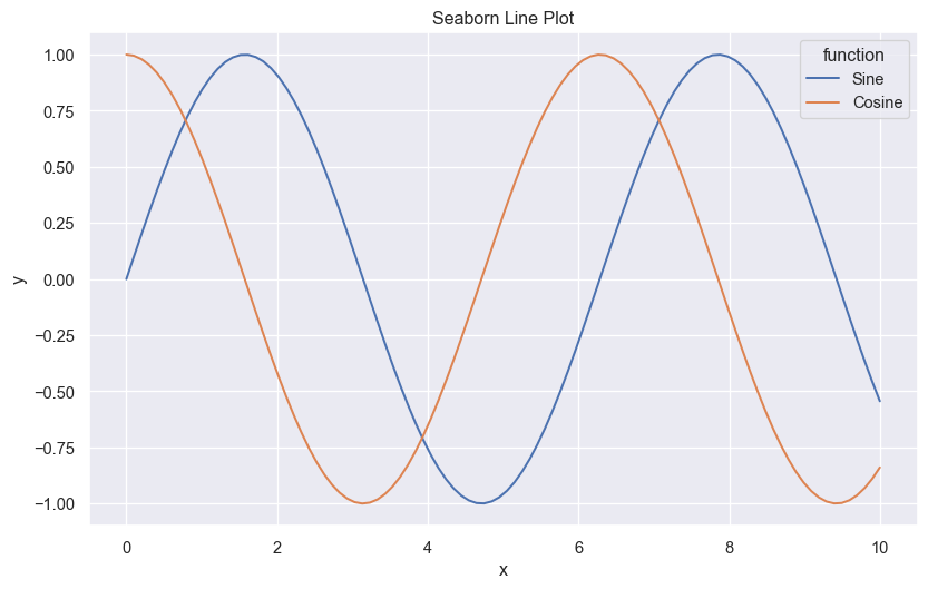
Altair:
import altair as alt
import pandas as pd
import numpy as np

x = np.linspace(0, 10, 100)
data = pd.DataFrame({
    'x': np.concatenate([x, x]),
    'y': np.concatenate([np.sin(x), np.cos(x)]),
    'function': ['Sine']*100 + ['Cosine']*100
})

alt.Chart(data).mark_line().encode(
    x='x',
    y='y',
    color='function'
).properties(
    width=600,
    height=400,
    title='Altair Line Plot'
)
Heatmap
Matplotlib:
import matplotlib.pyplot as plt
import numpy as np

data = np.random.rand(10, 12)

plt.figure(figsize=(10, 8))
plt.imshow(data, cmap='viridis')
plt.colorbar(label='Value')
plt.title('Matplotlib Heatmap')
plt.xlabel('X-axis')
plt.ylabel('Y-axis')
plt.show()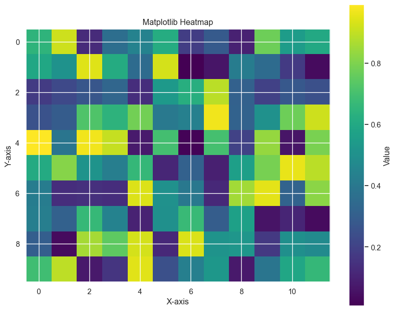
Seaborn:
import seaborn as sns
import matplotlib.pyplot as plt
import numpy as np

data = np.random.rand(10, 12)

plt.figure(figsize=(10, 8))
sns.heatmap(data, annot=True, cmap='viridis', fmt='.2f')
plt.title('Seaborn Heatmap')
plt.show()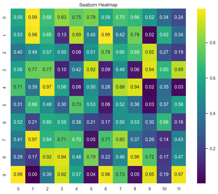
Altair:
import altair as alt
import pandas as pd
import numpy as np

# Create sample data
data = np.random.rand(10, 12)
df = pd.DataFrame(data)

# Reshape for Altair
df_long = df.reset_index().melt(id_vars='index')
df_long.columns = ['y', 'x', 'value']

alt.Chart(df_long).mark_rect().encode(
    x='x:O',
    y='y:O',
    color='value:Q'
).properties(
    width=500,
    height=400,
    title='Altair Heatmap'
)
Decision Framework for Choosing a Library
Choose Matplotlib when:
- You need complete control over every detail of your visualization
- You’re creating complex, custom plots
- Your visualizations will be included in scientific publications
- You’re working with very large datasets
- You need to create animations or specialized chart types
Choose Seaborn when:
- You want attractive plots with minimal code
- You’re performing statistical analysis
- You want to create common statistical plots quickly
- You need to visualize relationships between variables
- You want good-looking defaults but still need some customization
Choose Altair when:
- You want interactive visualizations
- You prefer a declarative approach to visualization
- You want concise, readable code
- You’re creating dashboards or web-based visualizations
- You’re working with small to medium-sized datasets
Integration Examples
Combining Seaborn with Matplotlib:
import matplotlib.pyplot as plt
import seaborn as sns
import numpy as np
import pandas as pd

# Create sample data
np.random.seed(42)
data = pd.DataFrame({
    'x': np.random.normal(0, 1, 100),
    'y': np.random.normal(0, 1, 100),
    'category': np.random.choice(['A', 'B', 'C'], 100)
})

# Create a figure with Matplotlib
fig, ax = plt.subplots(figsize=(10, 6))

# Use Seaborn for the main plot
sns.scatterplot(data=data, x='x', y='y', hue='category', ax=ax)

# Add Matplotlib customizations
ax.set_title('Combining Matplotlib and Seaborn', fontsize=16)
ax.grid(True, linestyle='--', alpha=0.7)
ax.set_xlabel('X Variable', fontsize=12)
ax.set_ylabel('Y Variable', fontsize=12)

# Add annotations using Matplotlib
ax.annotate('Interesting Point', xy=(-1, 1), xytext=(-2, 1.5),
            arrowprops=dict(facecolor='black', shrink=0.05))

plt.tight_layout()
plt.show()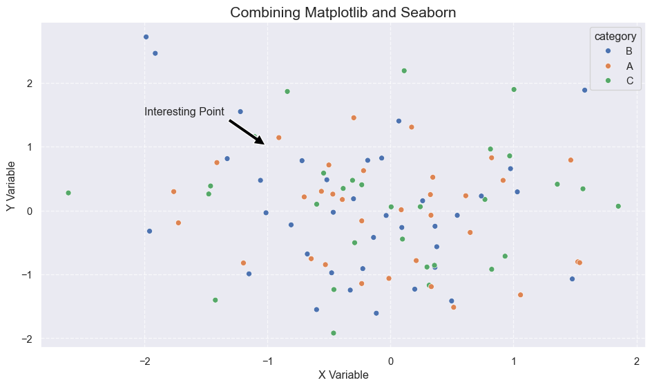
Using Altair with Pandas:
import altair as alt
import pandas as pd
import numpy as np

# Create sample data with pandas
np.random.seed(42)
df = pd.DataFrame({
    'date': pd.date_range('2023-01-01', periods=100),
    'value': np.cumsum(np.random.randn(100)),
    'category': np.random.choice(['Group A', 'Group B'], 100)
})

# Use pandas to prepare the data
df['month'] = df['date'].dt.month
monthly_avg = df.groupby(['month', 'category'])['value'].mean().reset_index()

# Create the Altair visualization
chart = alt.Chart(monthly_avg).mark_line(point=True).encode(
    x='month:O',
    y='value:Q',
    color='category:N',
    tooltip=['month', 'value', 'category']
).properties(
    width=600,
    height=400,
    title='Monthly Averages by Category'
).interactive()

chart
Performance Comparison
For libraries like Matplotlib, Seaborn, and Altair, performance can vary widely depending on the size of your dataset and the complexity of your visualization. Here’s a general overview:
Small Datasets (< 1,000 points):
- All three libraries perform well
- Altair might have slightly more overhead due to its JSON specification generation
Medium Datasets (1,000 - 10,000 points):
- Matplotlib and Seaborn continue to perform well
- Altair starts to slow down but remains usable
Large Datasets (> 10,000 points):
- Matplotlib performs best for large static visualizations
- Seaborn becomes slower as it adds statistical computations
- Altair significantly slows down and may require data aggregation
Recommended Approaches for Large Data:
- Matplotlib: Use
plot()instead ofscatter()for line plots, or tryhexbin()for density plots - Seaborn: Use
sample()or aggregation methods before plotting - Altair: Use
transform_sample()or pre-aggregate your data
Conclusion
The Python visualization ecosystem offers tools for every need, from low-level control to high-level abstraction:
- Matplotlib provides ultimate flexibility and control but requires more code and knowledge
- Seaborn offers a perfect middle ground with statistical integration and clean defaults
- Altair delivers a concise, declarative approach with built-in interactivity
Rather than picking just one library, consider becoming familiar with all three and selecting the right tool for each visualization task. Many data scientists use a combination of these libraries, leveraging the strengths of each one as needed.
For those just starting, Seaborn provides a gentle entry point with attractive results for common visualization needs. As your skills advance, you can incorporate Matplotlib for customization and Altair for interactive visualizations.